Bot Framework v4 Webchat Styling Options

The Starting Position#
Nowadays, styling is a hot topic. If it looks good - I’ll use it is often the mindset of users. So it’s very important to offer something very good-looking to be successful with what you do. And so it is with bots. The Microsoft Bot Framework team
did a pretty good job in styling the webchat component which is looking pretty good out of the box:
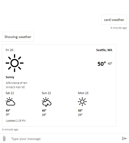
But companies often have the need to apply their CI/CD guidelines on whatever they use. So the white & black look of the webchat component is often not exactly what they need. Therefore, the Microsoft Bot Framework v4 webchat is offering the possibility to be customized in terms of styling. This is a great way for devs to modify the look and feel of the webchat. In the BFv4 Webchat GitHub repo there is a very detailed documentation on how to style the webchat using CSS within the HTML code. But looking at the following table which was taken from here you can see, that the React component offers even more options in terms of customization:
| CDN bundle | React | |
|---|---|---|
| Change colors | ✔ | ✔ |
| Change sizes | ✔ | ✔ |
| Update/replace CSS styles | ✔ | ✔ |
| Listen to events | ✔ | ✔ |
| Interact with hosting webpage | ✔ | ✔ |
| Custom render activities | ✔ | |
| Custom render attachments | ✔ | |
| Add new UI components | ✔ | |
| Recompose the whole UI | ✔ |
So I was currently searching a while until I found the documenation on how to customize the webchat styling when using it as a React component, which I want to share. It’s basically described here . The following list shows the default values, which, of course you can adapt to fit your needs.
StyleSetOptions#
The following samples show the default style set options which can be modified to style the React webchat component.
Color and paddings#
The default colors for the webchat background and paddings:
accent: '#0063B1',
backgroundColor: 'White',
cardEmphasisBackgroundColor: '#F0F0F0',
paddingRegular: 10,
paddingWide: 10 * 2,
subtle: '#767676'
Word break#
The defaults for word breaks:
messageActivityWordBreak: 'break-word', // 'normal' || 'break-all' || 'break-word' || 'keep-all'
Fonts#
The default fonts to be used:
fontSizeSmall: '80%',
monospaceFont: fontFamily(['Consolas', 'Courier New', 'monospace']),
primaryFont: fontFamily(['Calibri', 'Helvetica Neue', 'Arial', 'sans-serif'])
Avatar#
The default styling for the avatars of the user and the bot:
avatarSize: 40,
botAvatarBackgroundColor: undefined, // defaults to accent color
botAvatarImage: '',
botAvatarInitials: '',
userAvatarBackgroundColor: undefined, // defaults to accent color
userAvatarImage: '',
userAvatarInitials: ''
Bubble#
The default configuration for the bubbles, which is used to render chat messages (NOTE: The bubble* are used for bot messages and the bubbleFromUser* are used for rendering user messages):
bubbleBackground: 'White',
bubbleBorderColor: '#E6E6E6',
bubbleBorderRadius: 2,
bubbleBorderStyle: 'solid',
bubbleBorderWidth: 1,
bubbleFromUserBackground: 'White',
bubbleFromUserBorderColor: '#E6E6E6',
bubbleFromUserBorderRadius: 2,
bubbleFromUserBorderStyle: 'solid',
bubbleFromUserBorderWidth: 1,
bubbleFromUserNubOffset: 'bottom',
bubbleFromUserNubSize: 0,
bubbleFromUserTextColor: 'Black',
bubbleImageHeight: 240,
bubbleMaxWidth: 480, // screen width = 600px
bubbleMinHeight: 40,
bubbleMinWidth: 250, // min screen width = 300px, Edge requires 372px (https://developer.microsoft.com/en-us/microsoft-edge/platform/issues/13621468/)
bubbleNubOffset: 'bottom',
bubbleNubSize: 0,
bubbleTextColor: 'Black'
Markdown#
The default styling for markdown:
markdownRespectCRLF: true
Rich Cards#
The default styling for rich cards:
richCardWrapTitle: false, // Applies to subtitles as well
Root#
The default styling for the root properties:
rootHeight: '100%',
rootWidth: '100%',
Scroll to end button#
The default setting for the scroll to end button to be visible:
hideScrollToEndButton: false,
Send box#
The default styling options for the send box:
hideSendBox: false,
hideUploadButton: false,
microphoneButtonColorOnDictate: '#F33',
sendBoxBackground: 'White',
sendBoxButtonColor: undefined, // defaults to subtle
sendBoxButtonColorOnDisabled: '#CCC',
sendBoxButtonColorOnFocus: '#333',
sendBoxButtonColorOnHover: '#333',
sendBoxDisabledTextColor: undefined, // defaults to subtle
sendBoxHeight: 40,
sendBoxMaxHeight: 200,
sendBoxTextColor: 'Black',
sendBoxBorderBottom: '',
sendBoxBorderLeft: '',
sendBoxBorderRight: '',
sendBoxBorderTop: 'solid 1px #E6E6E6',
sendBoxPlaceholderColor: undefined, // defaults to subtle
sendBoxTextWrap: false,
Visually show spoken text#
Default option for spoken text to be visible:
showSpokenText: false,
Suggested actions#
Defaults for suggested action styling:
suggestedActionBackground: 'White',
suggestedActionBorder: undefined, // split into 3, null
suggestedActionBorderColor: undefined, // defaults to accent
suggestedActionBorderStyle: 'solid',
suggestedActionBoarderWidth: 2,
suggestedActionBorderRadius: 0,
suggestedActionImageHeight: 20,
suggestedActionTextColor: null,
suggestedActionDisabledBackground: undefined, // defaults to suggestedActionBackground
suggestedActionDisabledBorder: null,
suggestedActionDisabledBorderColor: '#E6E6E6',
suggestedActionDisabledBorderStyle: 'solid',
suggestedActionDisabledBorderWidth: 2,
suggestedActionDisabledTextColor: undefined, // defaults to subtle
suggestedActionHeight: 40,
Timestamp#
The default values for rendering timestamps:
timestampColor: undefined, // defaults to subtle
timestampFormat: 'relative', // 'absolute'
Transcript overlay buttons#
Defaults for overlay buttons (e.g. carousel and suggested action flippers, scroll to bottom, etc.):
transcriptOverlayButtonBackground: 'rgba(0, 0, 0, .6)',
transcriptOverlayButtonBackgroundOnFocus: 'rgba(0, 0, 0, .8)',
transcriptOverlayButtonBackgroundOnHover: 'rgba(0, 0, 0, .8)',
transcriptOverlayButtonColor: 'White',
transcriptOverlayButtonColorOnFocus: undefined, // defaults to transcriptOverlayButtonColor
transcriptOverlayButtonColorOnHover: undefined, // defaults to transcriptOverlayButtonColor
Video#
Default options for rendering videos as messages:
videoHeight: 270, // based on bubbleMaxWidth, 480 / 16 * 9 = 270
Connectivity UI#
Default options for the connectivity UI rendering:
connectivityIconPadding: PADDING_REGULAR * 1.2,
connectivityMarginLeftRight: PADDING_REGULAR * 1.4,
connectivityMarginTopBottom: PADDING_REGULAR * 0.8,
connectivityTextSize: '75%',
failedConnectivity: '#C50F1F',
slowConnectivity: '#EAA300',
notificationText: '#5E5E5E',

typingAnimationBackgroundImage: null,
typingAnimationDuration: 5000,
typingAnimationHeight: 20,
typingAnimationWidth: 64,

spinnerAnimationBackgroundImage: null,
spinnerAnimationHeight: 16,
spinnerAnimationWidth: 16,
spinnerAnimationPaddingRight: 12,

enableUploadThumbnail: true,
uploadThumbnailContentType: 'image/jpeg',
uploadThumbnailHeight: 360,
uploadThumbnailQuality: 0.6,
uploadThumbnailWidth: 720
Conclusion#
From my point of view it’s extremely important to use styling options to give your virtual assistant a more personal touch. That’s why I recommend everyone to walk through the docs which explain the process of customizing the BFv4 webchat component pretty good. Have fun customizing!
